Email capture is a conversion marketing fundamental, allowing retailers to continue the conversation and nurture subscribers into customers on an owned marketing channel. But what makes an effective lead capture pop-up?
Design and visual appeal often means the difference between an exit and a conversion, and when dealing with a large audience, a hundredth of a percent difference in your conversion rate could win or lose you thousands of subscribers.
Below, we will break down Justuno’s top three client email pop-up successes.
1. Mountain Standard: Clear copy + engaging imagery
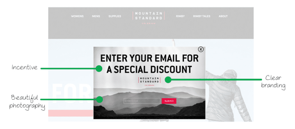
In most cases, straightforward copy tends to work the best. The headline boldly grabs a visitor’s attention and tells exactly what action must be taken to receive the value, in this case, a discount. This is a great example of marketing copy to start with. You know it’s going to work. If you feel like getting more creative, you can adjust your copy and A/B test against the original one.
On the pop-up, Mountain Standard has used the same color scheme as their website and also includes their logo. This creates a cohesive appearance that represents its brand effectively.
This brand also incorporated photography into their design. Not only is this a spectacular background image but also appeals to Mountain Standard’s ideal customer, the outdoor enthusiast.
Across all Justuno users, center-screen promotions see an average opt-in rate of 5.56%.
2. Karmaloop: High-value incentive
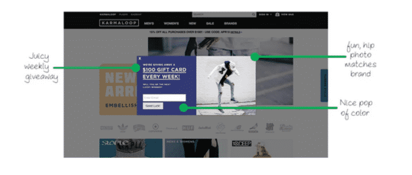
Karma Loop’s success with this promotion can be majorly attributed to their exciting incentive to be entered into a giveaway. The promise of winning a free shopping spree skyrocketed engagement and opt-in’s. They continuously run these giveaways to maintain amazing results without cutting into their profit margins too much.
Lifestyle and product photos that show off your brand are a great way to create an appealing and engaging promotion. As a streetwear brand, Karmaloop shows off their own styles and products in the background image of the promotion shown here. You can A/B test which type of imagery works best for your target audience: lifestyle, product, or something else altogether — the results may surprise you!
While using the same color scheme as your website for your pop-ups is a great way to design appealing promotions, sometimes you have to take it the other way. Here, Karmaloop uses a different color scheme for their promotion, but one that compliments their brand’s color scheme to attract attention.
3. Shinesty: Creative copy + fun imagery
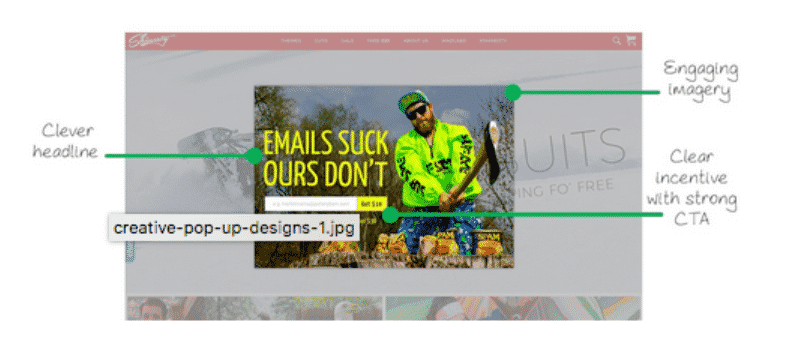
Clever and humorous copy has worked exceedingly well for Shinesty. The headline of this promotion “emails suck, ours don’t” resonates with their target audience who embraces this brazen brand personality to match the loud print clothes they’re known for. Continuing off of the clever headline, the imagery is nothing short of entertaining. This promotion’s background image features Shinesty apparel and continues the joke about spam emails effortlessly.
Shinesty uses a simple $10 off of orders over $30 which is a mutually beneficial offer. Shoppers get a discount and Shinesty has a consistent dollar amount discount so they know exactly what they are giving away (as opposed to a percentage off).
The CTA “Get $10” is also a very engaging and appealing way to word the discount, resulting in great opt-in rates for the brand. We recommend A/B testing dollar amount discounts versus percentage discounts to find what works for you and your customers.
Conclusion
These examples are great ones for drawing design inspiration for your own promotions. Use these strategies, tips and tricks to boost your promotions performance and increase opt-in rates. Afterall, Justuno found during a 90-day benchmark study that nearly 11% of client revenue was attributed to pop-up promotions.
To get started with a new promotion or pop-up, check out Justuno’s 14-day free trial to begin creating your design and to start building your list with first party data you’ve earned!
Join the Optily newsletter!
Stay up-to-date on platform changes, digital marketing tactics, and industry news. We promise we won’t spam!

