Be it from your CRM, Google Ads, or your website analytics, in digital marketing there’s a constant flood of information that needs to be organized, analyzed, and presented to really be usable. While some bigger companies have whole divisions that are responsible for data analytics, more often than not, the marketers at SMBs are doubling as analysts.
In order to help you while wearing your analyst hat (which may not always be the most comfortable one in your closet), we’ve put together a list of our top three tools that help your sort through your massive amounts of data generate visualizations that can help you and your team see what’s working and what isn’t at a glance.
Here are our top picks for tools to help marketers in creating impactful dashboards and graphics for team meetings, board meetings, or sales decks.
1. Tableau
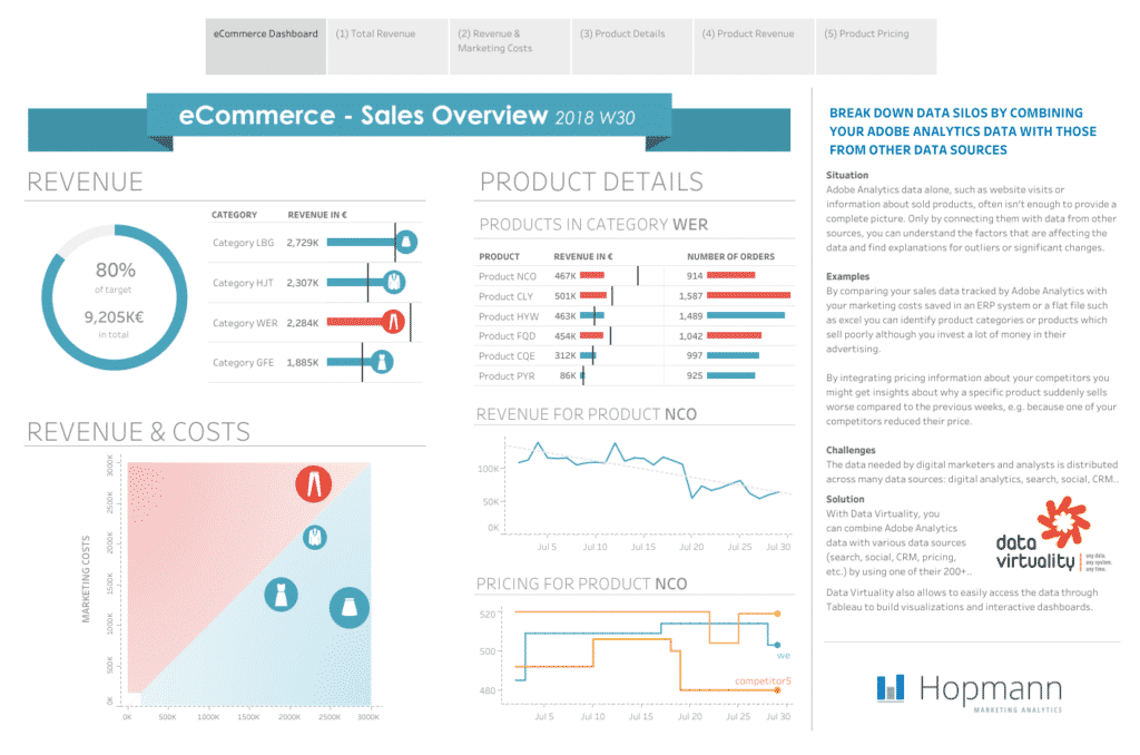
Tableau is the big name in the game of data visualization, so it’s probably no surprise that we put them as our #1. It’s super versatile and it can easily import data from tons of sources–CSVs, Ad Accounts, Salesforce, and more. Tableau is an incredibly powerful tool, but it’s also very intuitive, so the learning curve is not as steep as you might think for some of its basic functions.

There are also premade Marketing Dashboards that are already set up to pull in the data that marketers typically need. Of course, you can always go in and customize these to suit your needs or put together an entirely fresh one yourself. But if you’re just starting out, these out-of-the-box ready templates are a great way to get your feet wet.

 What we love:
- High graphic quality
- Easy-to-use (you don’t need to know code to get started)
- Amazing overall performance and speed
- Simple to sync to data sources
- Ready-made templates
- On-demand webinars and an amazing support community
- There’s a free version for you to practice on (but everything will be public)
 What could be better:
- It’s a bit pricey and the pricing plans are fairly rigid ($70/per user per month)
- While there is a free version, you probably won’t want your company data public
- There’s a lack of advanced IT support from Tableau
- Many dashboards can be built out without advanced coding, but not all. When some SQL queries do need to be set up, there is little support from the Tableau IT team in this regard
- It’s not a complete Business Intelligence tool
- You do need to invest time to truly master all the functionality and get the most out of Tableau
2. Whatagraph
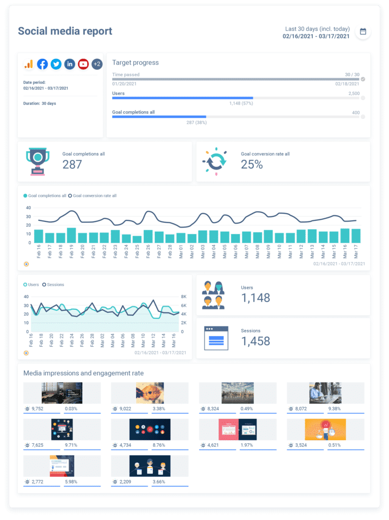
Whatagraph is a new player on the scene, but this startup is already making a big splash. Purpose-built for marketing data, this visualization tool is incredibly powerful for cross-channel metrics. Social media marketers swear by this software. They especially love the elegant interface that enables them to easily build out cross-channel dashboards. When it comes to data visualization, the whole point is to make data presentable and easy on the eyes. This is where Whatagraph truly excels. Users simply can’t get over how nice the reports are to look at–they seem more like infographics than dashboards!
That being said, there are some limitations on the integration ecosystem. It’s still relatively early days for these guys, so they’re likely going to be releasing more app integrations for things like Zapier, Salesforce, and HubSpot Marketing Hub.

 What we love:
- Standout visuals
- Seamless integration with the major data sources
- Automated report delivery
- Pre-made templates
- Simple drag-and-drop interface
- Easy collaboration
- Amazing customer service
- They’re still in the early stages, so they really take feedback to heart and make improvements to their software
 What could be better:
- Price is a bit steep–on par with Tableau (starting at $279/month for 5 users)
- Currently no Zapier integration
- Data sources are limited
- Backend UI is a bit cumbersome for customized reports
3. Google Data Studio
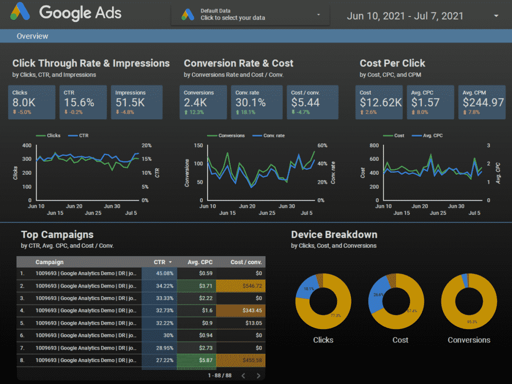
Sure, we’ve all worked with Google Analytics, but seeing as we have, we’re also familiar with its limitations. Data Studio is Google’s advanced option and a more reliable tool for marketers to pull reports and generate visuals. Data Studio is more of a bare-bones visualization and reporting tool. If you’re only dealing with a couple of main data sources and don’t need constant real-time updates across tons of ad platforms, CRM software, and sales data, then this could be a good fit for you. It’s free after all!
Data blending is not Data Studio’s strong suit, so depending on how extensive your needs are, you may be better off investing in a more robust solution like Tableau. And a big drawback is that you need to use Supermetrics in order to have your Facebook and Instagram data sync automatically with Data Studio. There are some workarounds, but they make the process a lot more manual and cumbersome.

 What we love:
- It’s free
- You really can’t beat completely free, especially if you’re strapped for marketing budget already
- Drag-and-drop dashboard creation
- Instant syncing with other Google products
- Tons of widget options for hyper-personalization of dashboards
- Made-for-you dashboard templates and tutorials
 What could be better:
- There’s no automated report building
- If you make a change to the root file, you need to manually refresh the whole thing
- No Facebook data reporting
- Blending data is a bit cumbersome
- Only 4 sources can be blended at a time and each additional one makes everything a lot slower
- Branding capabilities could be a bit more robust for the visualization tool


