In eCommerce, the vast majority, if not all in some cases, of the user experience with your brand will be entirely online. Sure, they might see a printed ad or call up a customer service representative on the phone, but most DTC brands won’t have a physical presence. This is why managing your online presence across every touchpoint is so critical.

We chatted with Ciarán Harris about what entails UX and what companies need to do to ensure that it’s as (positively) memorable as possible. Ciarán is the co-founder of Each&Other, a Dublin-based award-winning global UX Design consultancy. He is a Principal UX Designer, a seasoned technology leader, a product strategist, and a team creator, who has pioneered early technologies for mobile picture messaging, mobile gamification, and commercial IoT products.
We covered a lot of what is both good and bad among online retailers’ websites and beyond. Some of the key topics we’re highlighting below are:
- User experience milestones
- Approaching user testing
- Not annoying your users
Check out the full recording, if you have the time. Otherwise, take a minute to watch the preview clip and read the summary of the main points below.
Watch
Listen
Listen
Join the Optily newsletter!
Stay up-to-date on platform changes, digital marketing tactics, and industry news. We promise we won’t spam!
Positive user experience milestones for online brands
When asked about the main pillars that make up the user experience, the one that Ciarán mentioned first was leaving a good first impression. Be that a Facebook Ad, meeting an employee, or landing on their website. Whatever it is, it should somehow leave you with a good feeling and be memorable.
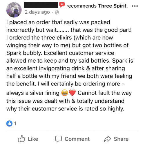
While we were discussing positive interactions here, Ciarán did feel that negative interactions needed mention. In any business, you’re going to have the bad parts. Be it a return because something was the wrong size, a complaint about the shipping costs, or a negative online review, you simply can’t run an online business without something eventually going wrong. How you handle these negative interactions and make them into positive (or as least neutral) experiences is key.
I came across a really good example of this on the Facebook reviews for the alcohol alternative brand Three Spirit:

For eCommerce particularly, Ciarán notes that the first-time experience on your website needs to be polished. They need to immediately feel that it’s easy and safe for them to shop with you. If there isn’t that immediate feeling of trust, then you’re going to lose out.
And lastly, make sure your nurture campaigns are not overly pushy. While you want to keep your customers coming back and making repeat purchases, you don’t want to be overbearing.
How to approach user testing
When you’re in the thick of things, you learn your own site’s little quirks and can often become a bit blind to them. What many brands would benefit from, in Ciarán’s opinion, is a pair of fresh eyes. Sure, you could go out and hire an agency to conduct extensive user testing and figure out which landing pages and UIs are the most optimized, but many companies aren’t going to have the time or money for all that.
At Each&Other, they usually keep the users testing simple. They establish cohorts of 5-6 testers, depending on how many audiences the brand is looking for data on. And use screen captures and recordings to see how they’re interacting with the site and what their reaction is.
On a budget, you can easily find a handful of friends or family members who know nothing about your site and just look at how they go through your site. This alone will enable you to capture a huge amount of data and identify the sticking points on your site.
Stop annoying your customers
We’ve all been there, as Ciarán explained, where we land on a site we’ve never been to before and are immediately bombarded with cookie banners, newsletter popups, and chatbots who want to help. Especially on mobile, this can be extremely frustrating. You don’t want to be one of these sites.
He also brought up automated shipping updates from Shopify that sometimes spam customers with half a dozen update emails before the product even ships.
Basically, stop doing all of this. You need to strike a balance between being helpful and annoying. The key to this is timing. There is a time and place for newsletter popup, but it’s just not as soon as they land on the page. Work our timings, test, and optimize to get it right.


